Kaiser Permanente
In collaboration with a clinical team, product strategy, and engineering, I led the design team to revamp Kaiser Permanente’s digital ecosystem. We won a 🏅 Webby Award 🏅for best health app in the process and were recognized by Fast Company as the 2022 Design Company of the Year.
Kaiser Permanente (KP)
Kaiser Permanente is one of the nation’s largest not-for-profit healthcare providers, serving 12.7+ million members at 39 hospitals and 734 medical facilities.
Challenge
Kaiser was looking for a way to engage its 12.7+ million members and improve patient care through digital experiences. Amidst antiquated, disconnected and underutilized digital touchpoints, we were challenged to restructure, redesign, build and launch a unified digital ecosystem. This would encompass a full redesign of its website, member app, and introduce new innovations such as an on-demand video, phone, and chat support.
My Role
● Collaborated with executives, content marketing, SEO strategists and key stakeholders to identify UX enhancements across KPs digital ecosystem.
● Led multiple teams of designers across various touchpoints.
● Crafted and tested a variety of high-fidelity prototypes.
● Used documentation, reviews, and presentations, to communicate clear and compelling ideas to a wide range of key stakeholders.
● Worked closely with engineering to ensure quality development.
Get Care Now
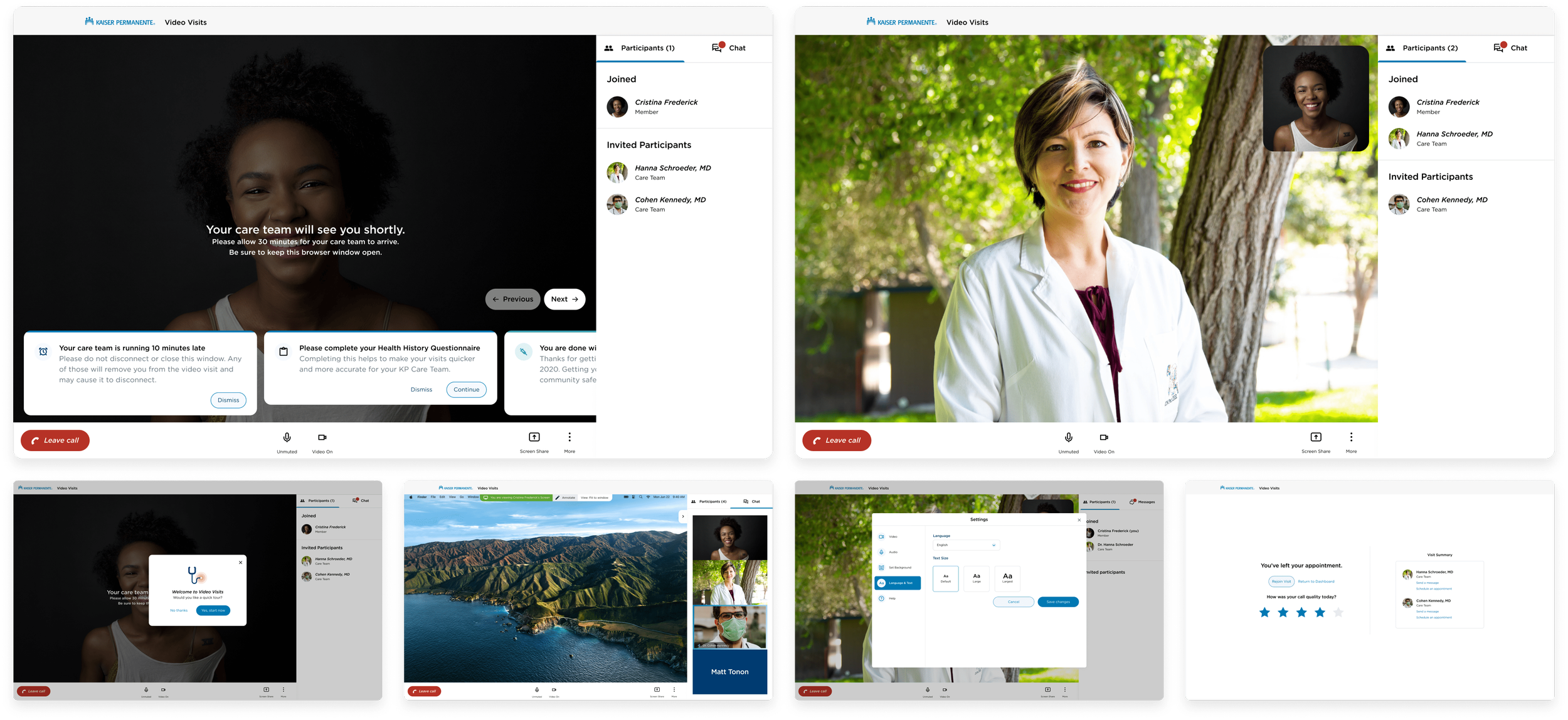
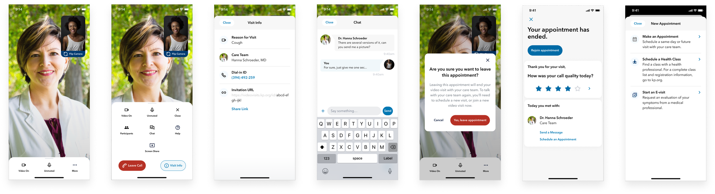
Although I directed several design teams across a range of digital touchpoints, I’m highlighting one of the most impactful, i.e., “Get Care Now” or Kaiser’s telehealth initiative. This initiative included getting on-demand support via video, telephone and chat. And, amidst COVID-19, could not be more relevant.
In late 2020, two of the biggest topics in the world were healthcare and video calls. Kaiser Permanente partnered with YML to transform how members received virtual care. Kaiser’s telehealth initiative could not just replicate a “Zoom”, “Skype” or the like, but had to be uniquely patient and doctor-centric. Thoughtful UX considerations went into crafting unique experiences for both the doctor and the patient.
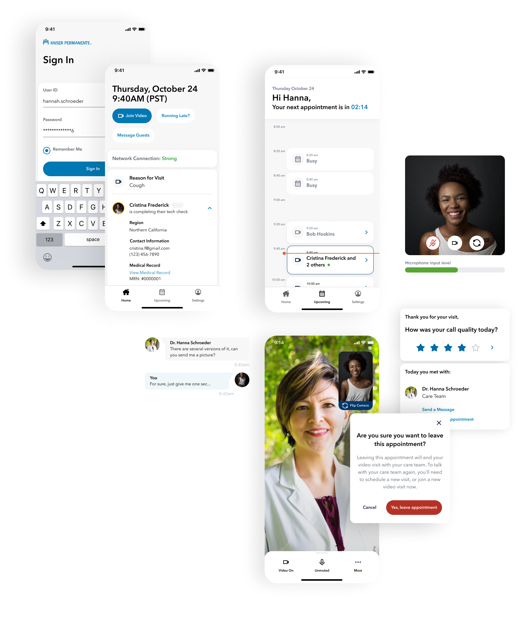
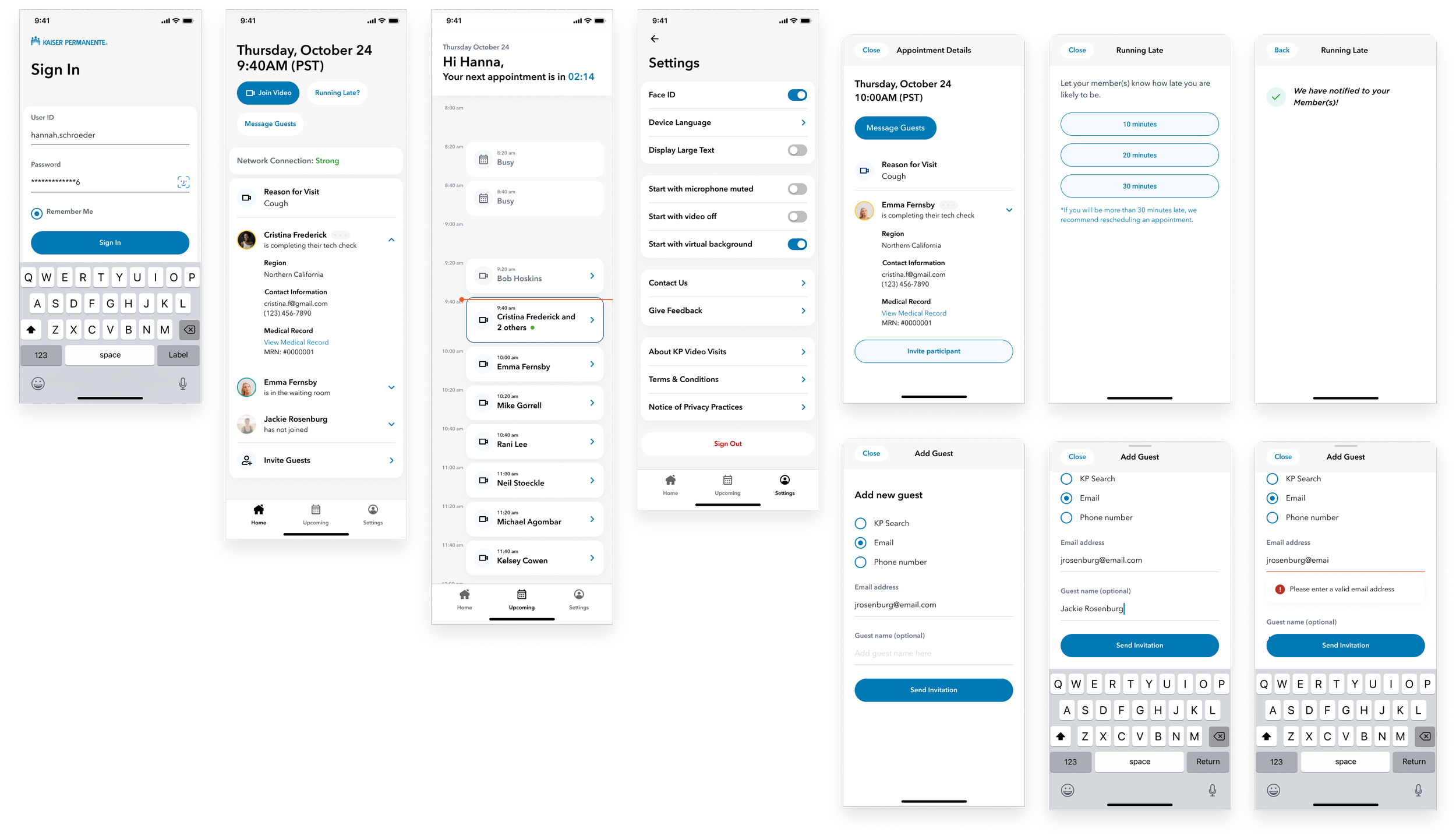
Mobile Call
In our design process, we prioritized our diverse audience. We recognized that patients vary in age, tech-savviness, and health, so we placed accessibility at the heart of our approach, ensuring patients never had to make assumptions.
Large, bold, and clear CTAs
Iconography always paired with descriptive text
Simple, understandable layouts
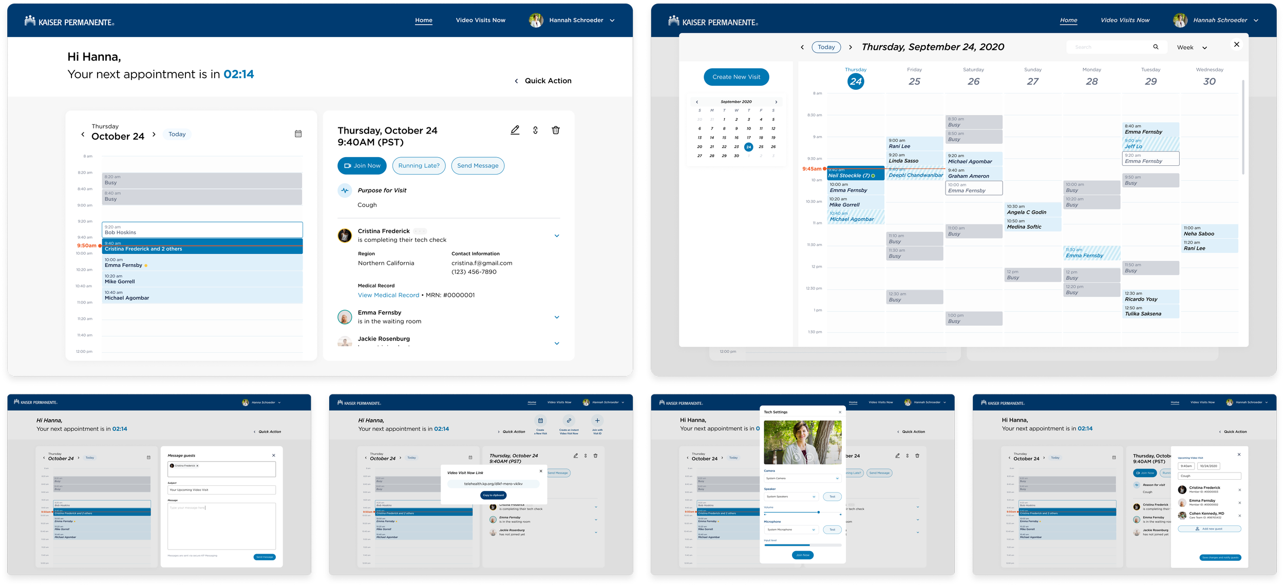
Designing for Doctor’s Scheduling Challenges
One major project challenge was grasping the true needs of doctors. To avoid assuming smooth schedules, we engaged with KP doctors, uncovering the realities of their workdays. Due to frequent delays, doctors struggled to be punctual for virtual appointments, causing a high rate of failed calls as patients left after waiting for 10 minutes. Meeting the core need for an efficient alert system to inform patients of delays became our priority.