YETI Bags
Launching a stellar brand into a new product category that won 🏅 W3 Awards Gold 🏅for best consumer goods website!

YETI
YETI, the brand needs no introduction. YETI bags? That’s another product story all together, and one I’m happy to share.
Challenge
YETI realized an untapped product opportunity that serves their audiences’ adventurous ambitions—Bags. They set out to launch an entire collection. This collection would also be the first that YETI would release exclusively on their website and not with other vendor partners. The challenge was to design a scalable, emotionally resonant shopping system that merged YETI’s rugged brand expression with modern, intuitive UX patterns across browsing, personalization, and decision-making.
The Ask
Co-create a fresh e-commerce experience for the entire YETI bags collection, inspiring people to unpack the possibilities for the life ahead.
My Role
● As UI/UX Design Lead, I led the end-to-end reimagination of the YETI Bags product experience. My role blended hands-on product design, interaction design, and cross-functional leadership across YETI and YML teams spanning five time zones.
● Collaborated with executive leadership to craft the UX vision and tactical plan to deliver a best-in-class e-commerce experience.
● Aligned and led a nimble team of designers and a content strategist to concept, craft and launch in 12 sprints.
● Connected the YETI brand with adventurous aspirations of consumers by balancing storytelling with functional and delightful product page UX.
● Elevated and extended the design system to include new style guides, patterns and scalable assets.
Deliverables
Product Vision, Figma UX/UI and ProtoPie Prototypes, Expanded Design System, Functional Specifications, Coded Prototypes, Content Architecture, Copywriting
Kicking off
The Kickoff meeting is crucial for setting the tone for a successful collaboration. My goal was to leave the team inspired, empowered and confident in our approach, and one another. Prior to the official kickoff, I invited the team to a shared Figma space for collaborative exercises the day of. One exercise that went well was a “show and tell”. The team dropped in gifs, screenshots, links, etc., to showcase best-in-class e-commerce experiences or adjacent ones which inspired them. This served to build alignment, establish a shared understanding, and gave a glimpse into each team member's taste, personality and how they were thinking about the project.
We also brainstormed names for our team project. After discussing guiding design principles and qualities we valued for a successful project, we landed on “Collaboratory”, a space for creative experimentation, a space of ‘yes…and’, a space to co-create, fail, learn and repeat. If you’d like to hear more about this, drop me a line and I’ll walk you through the full case study.

Aligning around content
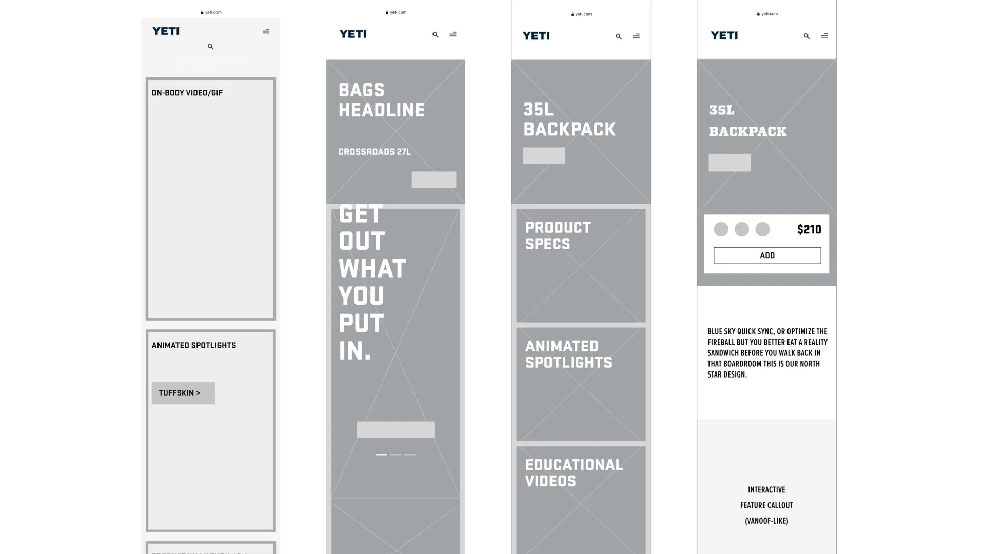
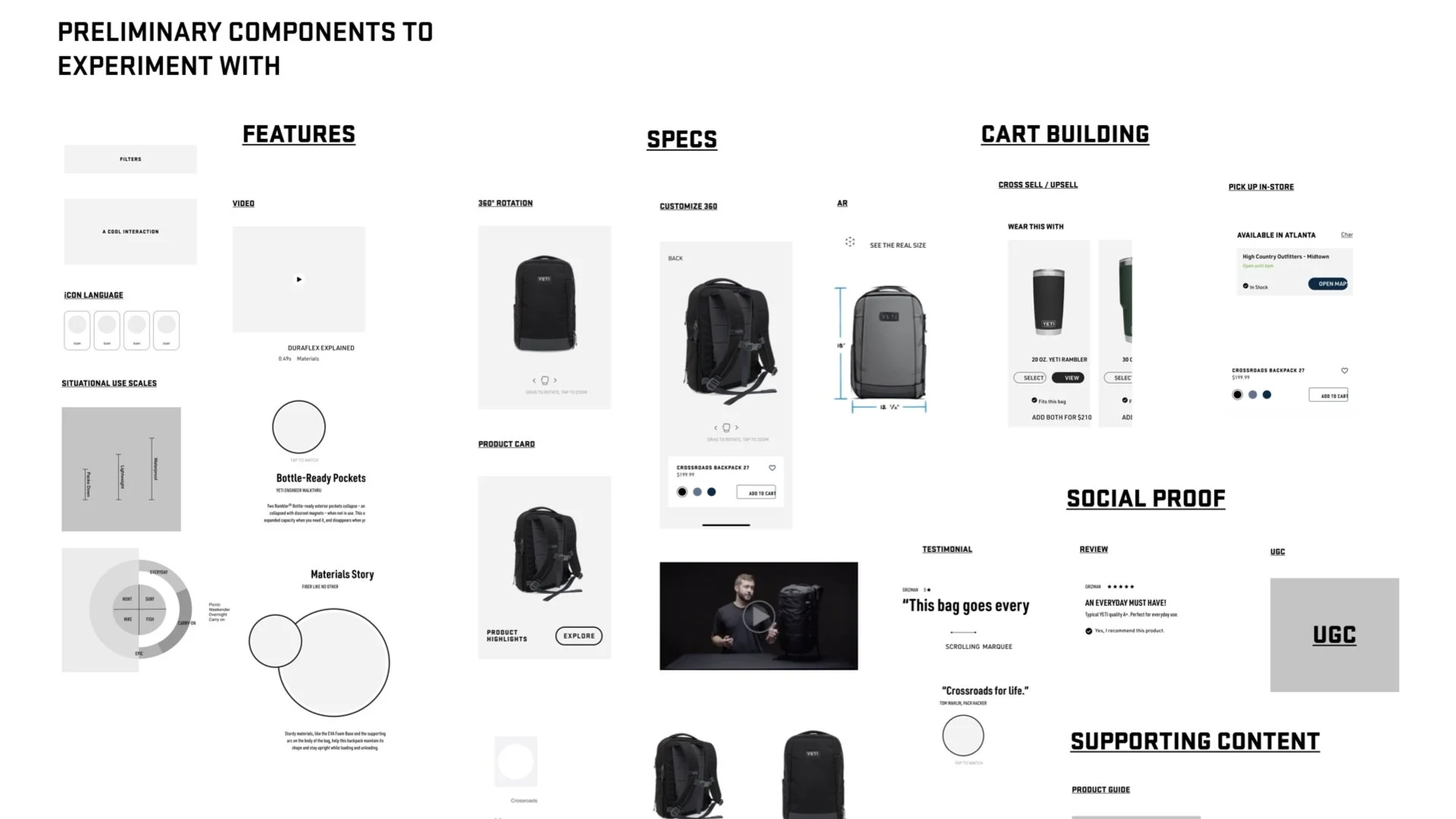
After defining desired content types, e.g., video, on-body photography, animated spotlights, etc., we created wireframe components for the rest of the team to experiment with and have conversations around. This accelerated alignment and was essential for visualizing the structure and layout of the site.
Movement and Momentum
YETI is about movement and momentum, and being inspired to unpack wild adventures. We immediately considered the behavior of the design by crafting both low and high-fidelity prototypes. These would guide the way, and motion was never an afterthought.
Low-fidelity prototypes were created to enable an early feel of potential interaction design solutions.
Experiments with small file-size photos and animated gifs were crafted to provide a captivating and immersive brand experience without compromising page load time.
Art-direction in the form of high-fidelity prototypes ignited inspiration among both the team and key stakeholders, revealing the realm of possibilities that could be achieved.
Functional, interactive prototypes were made to test with users and assist our development team.
Balancing story with commerce
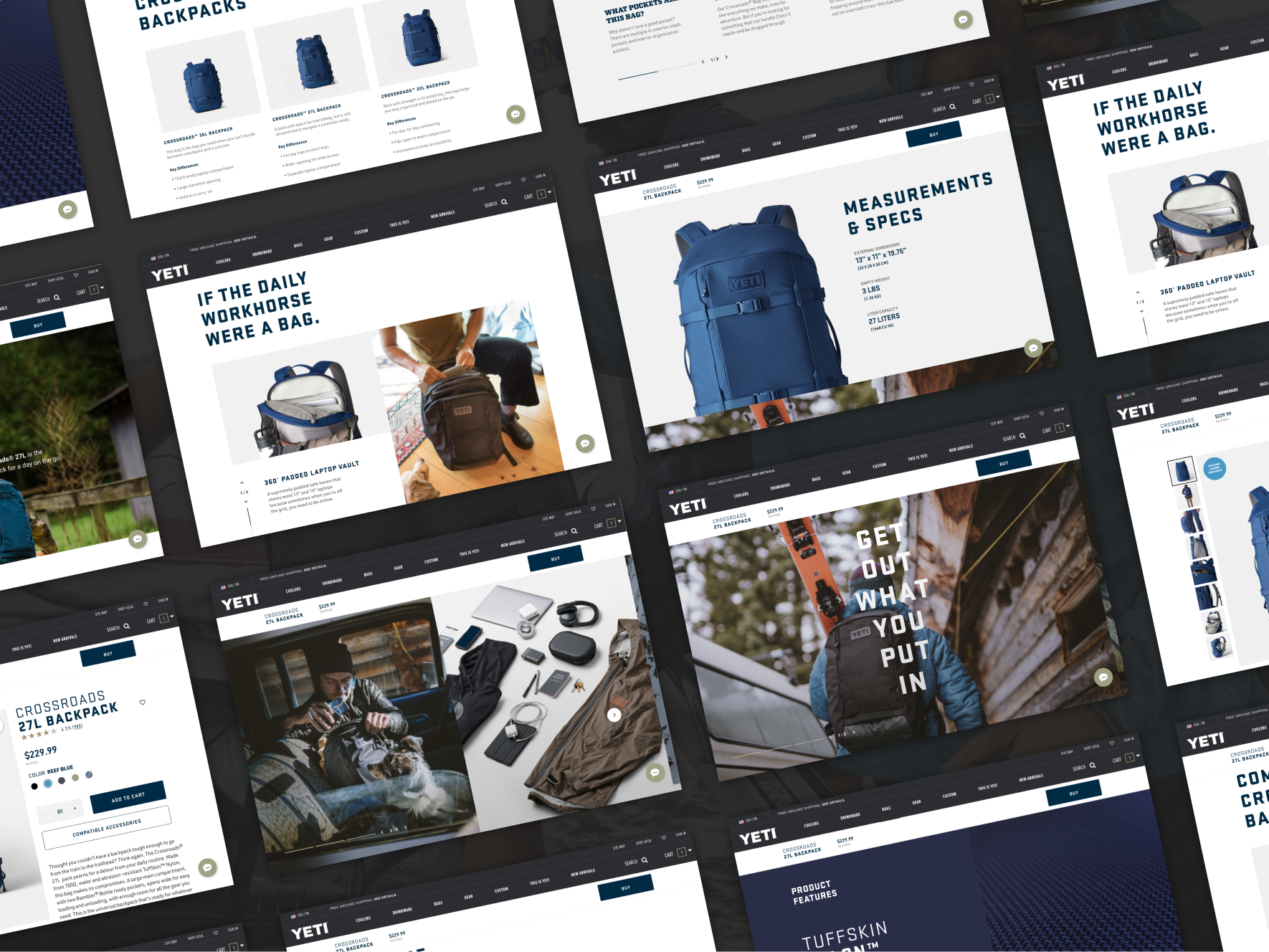
In addition to this collection being the first that YETI would release exclusively on their website and not with other vendor partners, it was also the first time that YETI would make use of on-body and lifestyle photography, animated GIFs, and videos, augmented reality (AR) product previews, etc.
We sought to use these content elements creatively to help YETI tell their story and encourage consumption.
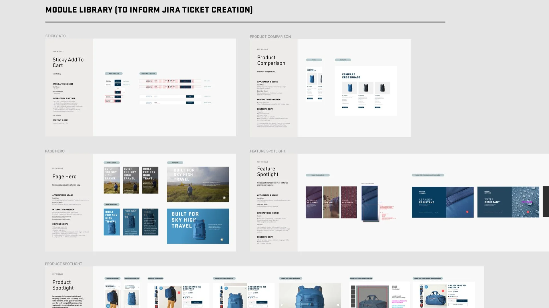
Built to scale across full product offering
We designed a refreshed brand system with scale in mind. Using modular components, the experience can now be mixed and matched to tell the right story, in the right context, at the right time.
Beyond designing systematically with scale in mind, we also assisted the Product and Engineering team by providing functional specs and usage guidelines. These, along with prototypes would help to ensure quality, leaving little to be lost in translation.
Outcomes
Following extensive deliberation, experimentation, testing, and refinement. We launched an award-winning e-commerce site to support a new product category for a multi-billion dollar brand.
We designed a refreshed brand system with scale in mind, using modular components which can now be mixed and matched to tell the right story, in the right context, at the right time.
The product page template(s) span across 14 new bags, and will grow to include a large portion of the entire YETI catalogue.
🤗 Within 24 hours of launch, the collection sold out entirely! 🤗
Although YETI Bags was an entirely new product line, we measured early performance against YETI's established e-commerce baselines for similar product categories.
Within the first quarter after launch, the new experience outperformed the site’s historical benchmarks, driving:
• 66 percent higher conversion rate
• 48 percent more PDP views
• 53 percent improvement in add-to-cart rateThese metrics validated the guided buy-flow, storytelling model, and modular product architecture we introduced.
If you’d like to hear more about this, drop me a line and I’ll walk you through the full case study.